 English
 Français
 Deutsch
 Español
 Italiano
 Русский
 Português
 العربية
 Türkçe
 Magyar
 Svenska
 Nederlands
 Ελληνικά
 Български
 Polski
 Gaeilge
 Dansk
Dansk Lietuvių kalba
 Suomi
Suomi Hrvatski
 Română
 Latviešu valoda
 Korean
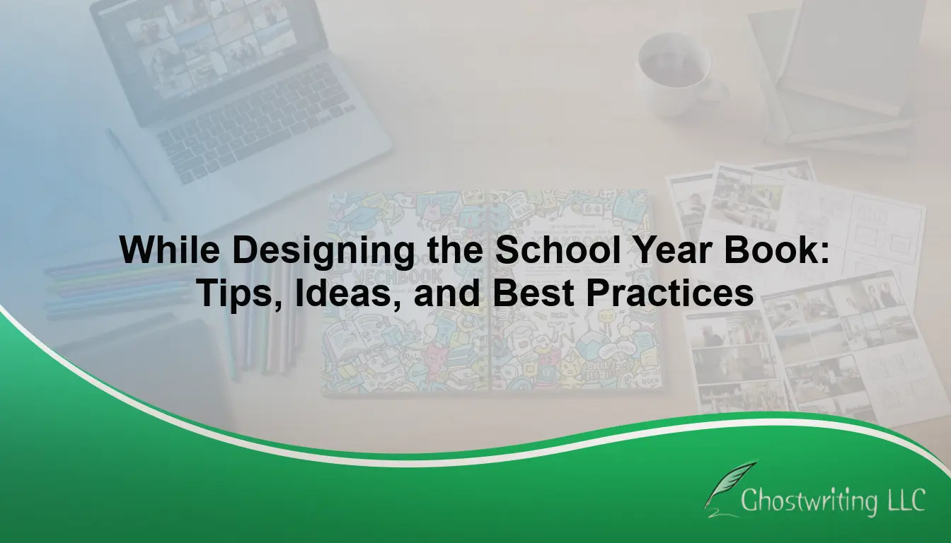
Creating a school yearbook is a monumental editorial and design undertaking. It requires balancing the nostalgia of the student body with the technical precision of professional publishing. Whether you are a faculty advisor guiding a student committee or a dedicated editor tasked with preserving the year’s memories, mastering the workflow is essential for delivering a high-quality publication. While designing the school yearbook, the best practice is to first establish a clear unifying theme, utilize a structured page ladder for organization, apply consistent typography and color palettes, balance structured portraits with dynamic candid photography, and ensure all design elements meet high-resolution print standards to create a cohesive and timeless memory book.
To dominate both the visual appeal and the structural integrity of your publication, you must move beyond basic templates. By engineering a comprehensive design framework, you ensure that every page serves a purpose, tells a story, and survives the test of time. Here is a definitive blueprint for executing a flawless yearbook project.
Phase 1: Architectural Foundation and Project Mapping
Before launching your design software, the structural mechanics of the book must be finalized. A common pitfall for yearbook committees is diving into page creation without a macroscopic view of the project, leading to disjointed sections and missed deadlines.
Mastering the Yearbook Ladder
The page ladder is your editorial command center. This spreadsheet or visual storyboard maps out what goes on every single page, from the inside cover to the final index. A well-optimized ladder prevents redundant content and ensures equitable coverage across all grade levels, sports, and extracurricular activities. Best practices dictate color-coding your ladder by section—student life, academics, clubs, sports, and portraits—to visualize the rhythm and pacing of your publication.
Establishing Thematic Cohesion
A theme is more than just a catchphrase; it is the visual and verbal glue that binds the book together. The most successful themes capture the specific zeitgeist of that particular school year. Once a concept is selected, it should dictate your graphic motifs, folio design (page numbers), and headline copy. Ensure your theme is versatile enough to be adapted across different sections without becoming repetitive or forced.
Phase 2: Visual Mechanics and Layout Strategy
With the blueprint established, the focus shifts to the visual architecture. Designing a yearbook requires strict adherence to graphic design principles to ensure readability and aesthetic harmony.
Implementing Grid Systems and White Space
Professional layouts rely on grid systems to maintain alignment and proportion. By utilizing a pica grid, designers can lock photos, text boxes, and graphic elements into a structured framework. Equally important is the strategic use of negative space, or “white space.” Instead of cramming every square inch with images, allow your layouts to breathe. Strategic white space draws the reader’s eye directly to the dominant photo and the accompanying narrative, elevating the overall perceived quality of the book.
Typographic Hierarchy
Font fatigue is a common issue in amateur publications. To maintain an authoritative and clean aesthetic, limit your typography to three distinct font families: a bold display font for primary headlines, a highly readable serif or sans-serif font for body copy, and a contrasting font for captions and subheadings. Consistency is paramount. If you choose a 10-point Helvetica for captions on page five, that exact specification must remain identical on page two hundred.
Color Palette Standardization
While school colors traditionally anchor the publication, a secondary palette derived from your overarching theme adds depth to the design. Establish specific CMYK hex codes early in the process and enforce their use. Avoid using highly saturated neon colors for backgrounds, as they often conflict with the varied color profiles of student photographs and can cause issues during the commercial printing phase.
Phase 3: Crafting the Narrative and Student Experience
A yearbook should be a journalistic time capsule, not just a photo album. The way you tell the stories of the student body determines the emotional resonance of the final product.
Storytelling Beyond the Standard Portraits
Capturing student personalities requires more than just a name printed under a portrait. Think about how literature brings individuals to life; for example, taking a Wonder book characters quiz reveals distinct, memorable traits about each persona. Apply that same concept to your student body by including micro-profiles, interactive polls, and student-submitted quotes. Highlighting these unique, diverse characteristics transforms a static directory into an engaging, character-driven narrative.
The Rule of Dominance in Photography
Every spread must feature a dominant photo—an image that is at least two to three times larger than any other element on the page. This creates a visual entry point. Surround the dominant image with a series of smaller candid shots that provide context and action. Ensure that every photograph is accompanied by an active-voice caption that identifies the subjects and explains the context of the moment, answering the fundamental journalistic questions: who, what, when, where, and why.
Phase 4: Pre-Print Quality Control and Technical Auditing
The final phase bridges the gap between digital design and physical production. Neglecting technical best practices here can ruin months of hard work.
Resolution and Bleed Margins
Print requires a much higher data density than digital screens. Every single image placed in the yearbook must be at least 300 DPI (Dots Per Inch) at its physical print size. Furthermore, any design element meant to touch the edge of the page must extend past the trim line into the “bleed” area—typically an extra 1/8th of an inch. This prevents unseemly white borders if the commercial paper cutter is slightly misaligned.
The Triple-Proofreading Protocol
Misspelled names are the most common and unforgivable errors in yearbook design. Implement a strict triple-proofreading protocol where three different individuals review every page. One reader should focus solely on name spellings against the official school roster, a second on grammatical accuracy and caption flow, and a third on design consistency and alignment.
High-Intent FAQs: Yearbook Design Best Practices
How do you choose a theme for a school yearbook?
Select a theme by brainstorming concepts that reflect the unique experiences, milestones, or cultural shifts of the current school year, ensuring it translates well into both visual motifs and written headlines.
What is a yearbook ladder?
A yearbook ladder is a page-by-page organizational chart that maps out the entire publication, dictating the specific content, section, and deadline for every individual spread.
Which fonts are best for yearbook design?
The best approach is to use a typographic pair: a highly legible serif or sans-serif font (like Garamond or Open Sans) for body copy, paired with a bold, distinct display font for headlines.
How many photos should be on a yearbook page?
A standard yearbook spread should feature 5 to 7 photos, anchored by one dominant image that is significantly larger than the supporting candid shots.
What resolution is required for yearbook photos?
To ensure crisp, professional printing, all yearbook photographs must be submitted and placed at a minimum resolution of 300 DPI (Dots Per Inch) in a CMYK color format.
Disclaimer: Ghostwriting LLC provides information for educational purposes only. Your own research is necessary, as we do not guarantee anything. Our services include publishing support, ghostwriting, marketing, and editing to help authors prepare their work for submission.