As a graphic designer specializing in book cover art and visual branding, I’ve spent over a decade studying what makes covers memorable, marketable, and meaningful. Few titles test a designer’s skill like Frank Herbert’s Dune. With its rich political intrigue, philosophical depth, and desert landscapes, the Dune book cover must not only attract a reader but also do justice to the scale of the story. This article explores what makes a great Dune book cover—from a designer’s perspective—drawing on both historical examples and design theory.
The Significance of the Dune Book Cover
A book cover is often the first introduction a reader has to a story. It’s the visual entry point to the world within the pages. For Dune, a novel with complex themes of ecology, politics, religion, and power, the book cover must act as a visual ambassador, conveying not just the plot but also the tone and depth of the world Frank Herbert created.
Over the decades, Dune has seen many different cover designs, each reflecting not just the aesthetic trends of the time but also shifting audience expectations and the novel’s evolution as a cultural icon. The cover of Dune carries immense weight, as it shapes how readers—whether they’re familiar with the book or new to it—perceive the material inside.
Understanding the Dune Universe: A Designer’s Challenge
From a design standpoint, Dune presents a rare challenge. It’s a sci-fi epic rooted not just in action or technology but in abstract themes like destiny, ecology, and messianic prophecy. Designing a cover that hints at those themes without overwhelming or confusing the viewer requires a nuanced understanding of both the narrative and the principles of visual communication.
In my experience, readers often respond more strongly to metaphor than literal representation. That’s why some of the most effective Dune covers lean on minimalism or symbolic imagery—such as the silhouette of a sandworm or a lone figure in a vast desert—rather than complex character portraits. These designs encapsulate the essence of the novel—vast, philosophical, and otherworldly—without overloading the viewer.
Key Design Elements in Dune Book Covers
A. Typography: The Visual Language of the Novel
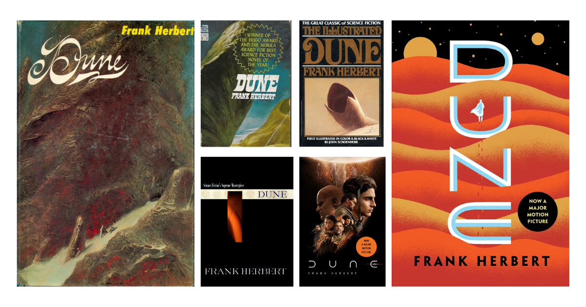
The font choice on a book cover does more than set tone—it defines genre and speaks to the book’s legacy. In the case of Dune, the typography has always been integral to the visual identity of the novel. The Art Nouveau typefaces used in the 1965 first edition by artist John Schoenherr reflect the intricate, almost mystical world of Arrakis. This ornate style helped signal that Dune was not just another sci-fi story but a narrative of great depth, filled with religious and ecological symbolism.
In contrast, the Penguin Galaxy edition (designed by Alex Trochut) reflects a sleek, modern approach, moving away from the ornate and embracing a more minimalist style. The clean lines and sophisticated typography reflect the novel’s more contemporary reach, as it expands into a global audience.
From my perspective as a designer, the best typography choices for Dune covers are those that echo the tension between past and future—between the book’s ancient prophecies and futuristic tech. Typography becomes a visual metaphor for this paradox.
B. Imagery: Reflecting the Depth of the World
The imagery used in Dune book covers is vital to capturing the vastness and complexity of the novel. Dune is not just about space battles or alien species—it’s about a struggle for power, the preservation of ecology, and the intersection of religion and politics. Early designs, like Schoenherr’s 1965 cover art, often used symbolic representations of the sandworms or otherworldly deserts to evoke the book’s mystical, apocalyptic tone.
Schoenherr’s illustrations were so accurate that Frank Herbert himself remarked that they matched his own mental images of the desert planet Arrakis. This connection between the illustrator’s work and the author’s vision became an essential part of Dune’s identity.
In modern covers, imagery has often taken on a more abstract or minimalist approach. The 2016 Penguin Galaxy edition, for instance, uses gold and black, symbolizing the power and wealth of the ruling houses while maintaining a sense of mystery and grandeur. These design choices elevate the narrative’s exploration of destiny, control, and fate.
C. Color Palette: Symbolism and Mood
The color palette used in Dune covers is often symbolic, reflecting key themes in the novel. In the early editions, the color choices were often muted and earthy, mirroring the barren landscapes of Arrakis. As the design aesthetic has evolved, so have the color choices.
The Penguin Galaxy edition (2016), for instance, makes strong use of gold and black. This not only reflects the opulence and power of the noble houses and the spice trade but also subtly invokes the mysticism and grandeur that are central to the Dune universe. This color scheme is used across multiple formats, showing how integral color is to the overall design and theme of the series.
In my experience, color plays an instrumental role in setting tone. A strong palette can instantly evoke a feeling—mystery, danger, or regality—without any words needed.
D. Composition and Layout: Balancing Complexity
The composition of a Dune cover has evolved significantly over the years. Early editions used more centralized compositions with the focal points often mirroring the key elements of the story—like the desert, sandworms, and the protagonist. As time progressed, more dynamic and unconventional layouts began to surface, reflecting the changing tastes in design and the increasing globalization of book marketing.
Modern designs often employ asymmetry, which can be a way of introducing tension or emphasizing the chaos in the story, such as the political unrest and the messianic undercurrents. A modern Dune cover might break symmetry deliberately, drawing the eye to a single striking image or symbol—such as a distant sandworm or the face of a central character.
In my own design projects, asymmetrical layouts have been particularly effective in drawing attention to key themes of the narrative, offering an element of visual disruption that mirrors the turmoil within the story.
Challenges in Designing a Dune Book Cover
Designing a Dune cover is not without its challenges. One of the most significant challenges is balancing the complexity of the book’s themes with the need for visual clarity. With its multiple characters, vast political machinations, and deep philosophical undercurrents, it’s tempting to over-represent the material. A designer’s skill comes in knowing how to simplify the narrative into key motifs that can be easily understood by readers at first glance.
Another challenge is the tension between traditional fans of Dune and new audiences. Longtime readers may have a preference for designs that echo the original 1965 aesthetic, while newer audiences may be more drawn to minimalist, contemporary visuals. A designer must consider the expectations of these diverse groups while keeping the overall cover fresh and dynamic.
The Future of Dune Book Cover Design
As the Dune franchise continues to grow, it’s likely that book cover designs will increasingly reflect the broader media landscape. With the success of the recent film adaptations, it’s possible we’ll see cinematic-style covers that incorporate photographic imagery, digital illustrations, and perhaps even interactive or augmented reality elements in future editions. These designs would integrate the visual language of film with the traditional elements of book design, resulting in covers that draw in both Dune fans and a broader audience.
For book cover designers, this presents a unique opportunity to blend traditional design with cutting-edge digital trends, creating a new chapter in the visual evolution of Dune.
Conclusion
The Dune book cover is much more than a marketing tool; it’s an integral part of the novel’s identity. From the early, illustrative designs to the modern, minimalist covers, Dune book covers have always been a reflection of the novel’s evolving cultural significance. For designers, creating a great Dune book cover requires an understanding of the narrative’s themes, a mastery of design principles, and the ability to balance tradition with innovation.
As Dune continues to captivate new generations of readers and moviegoers, the book cover will undoubtedly evolve—offering new opportunities for designers to craft visually stunning and thematically rich representations of this beloved classic.
FAQs
1. What makes a Dune book cover visually compelling?
A compelling Dune cover uses symbolism, minimalism, and rich color palettes to reflect the novel’s complex themes like ecology, politics, and mysticism while capturing reader attention.
2. Who designed the original Dune book cover?
The original 1965 Dune cover was illustrated by John Schoenherr, whose visionary artwork closely aligned with Frank Herbert’s descriptions of Arrakis and its desert landscapes.
3. How have Dune book covers changed over time?
Over the years, Dune covers have evolved from detailed illustrations to modern, minimalist designs—often influenced by film adaptations and contemporary graphic design trends.
4. What design elements are essential in a Dune book cover?
Key elements include bold typography, desert-inspired imagery, symbolic motifs like sandworms or spice, and a color palette that reflects the story’s tone and themes.
5. Can movie-inspired Dune covers impact reader perception?
Yes, film-inspired covers can attract new readers but may also shift focus from the novel’s deeper themes toward visual branding tied to cinematic marketing.
