 English
 Français
 Deutsch
 Español
 Italiano
 Русский
 Português
 العربية
 Türkçe
 Magyar
 Svenska
 Nederlands
 Ελληνικά
 Български
 Polski
 Gaeilge
 Dansk
Dansk Lietuvių kalba
 Suomi
Suomi Hrvatski
 Română
 Latviešu valoda
 Korean
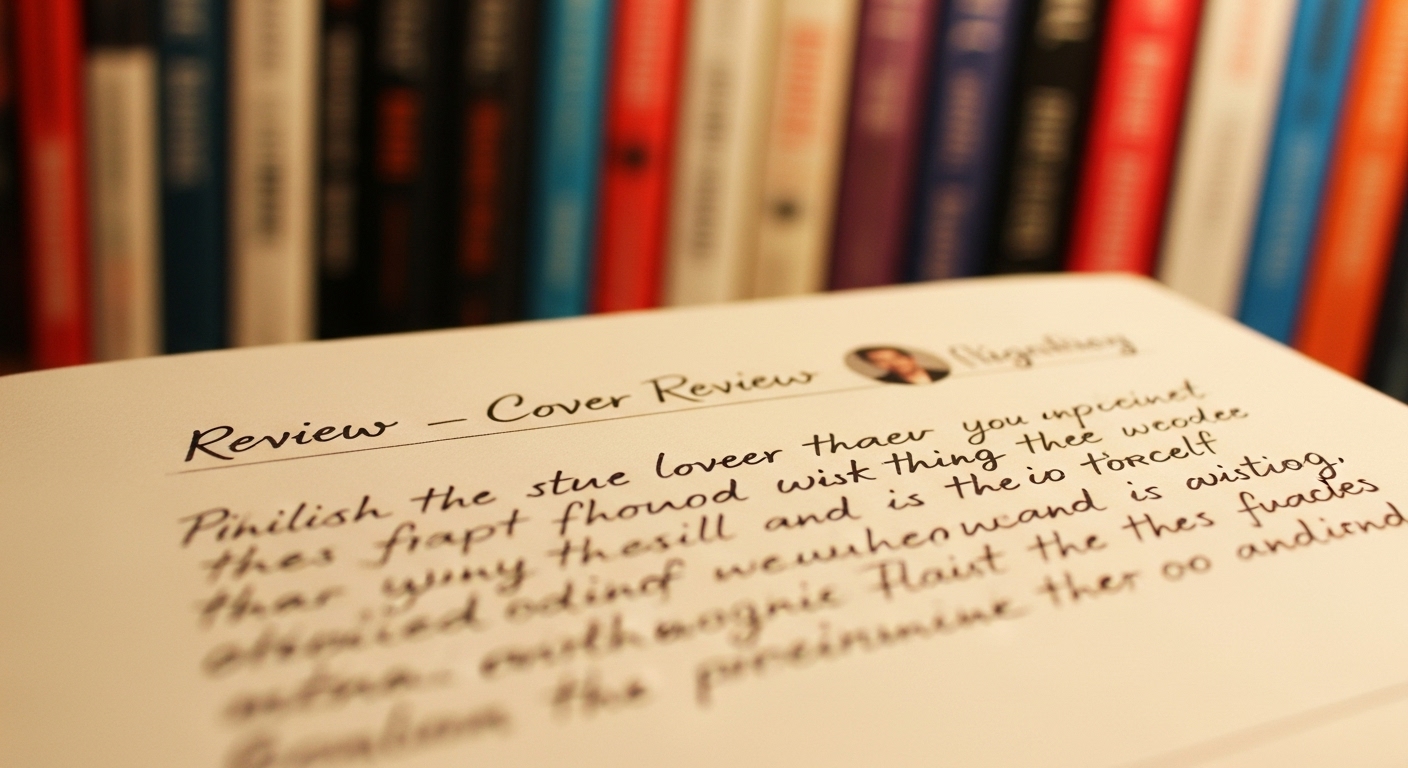
We’ve all heard the saying, “Don’t judge a book by its cover,” but let’s be honest—most readers do. A book’s cover is the very first thing people see, and in a crowded market, it plays a big role in influencing whether someone picks up a book or scrolls right past it.
That’s why book cover reviews are gaining popularity—not just among design enthusiasts, but also book bloggers, marketers, and authors looking to improve their visual branding. Unlike a standard book review that discusses the story or content, a cover review focuses solely on the design—its appeal, effectiveness, and connection to the genre.
In this blog, we’ll explore what goes into a strong book cover review, how to write one that’s insightful and respectful, and why these reviews matter for authors and designers alike.
Whether you’re a reviewer, reader, or even an author yourself, this guide will help you evaluate covers with a sharp, thoughtful eye.
A. What’s About Book Cover Review?
A book cover review is a critique that focuses entirely on the front cover of a book. It’s not about what happens inside the pages, but about how the book presents itself visually to its audience. A good cover review dives into elements like color, typography, imagery, layout, and whether or not the design aligns with the book’s content and target market.
You might write a cover review for:
- A design blog or portfolio
- A book marketing platform
- A book review site or YouTube channel
- An author who’s seeking feedback on a cover redesign
The purpose is to help creators see how their book might be perceived at first glance and whether it’s doing the job it’s supposed to—attracting the right readers.
B. Why Book Cover Reviews Matter
Book cover reviews serve more than just an aesthetic purpose—they can have a real impact on sales, branding, and reader engagement. Here’s why they matter:
- Covers influence first impressions
Before anyone reads a blurb, preview, or review, the cover is what grabs attention.
- They reflect the professionalism of the book
A high-quality cover can immediately signal quality storytelling and credible publishing.
- They help authors improve their marketing
Feedback on design can guide self-published authors or indie publishers toward better positioning.
- Designers benefit from real-world critique
Honest but constructive cover reviews help book designers understand what’s effective in different genres.
In short, reviewing book covers thoughtfully isn’t about being picky—it’s about understanding visual storytelling.
C. Key Elements to Analyze in a Book Cover Review
A strong book cover review breaks down the design into specific elements. Here’s what to focus on:
1. Visual Appeal
Ask yourself:
- Does the cover grab attention?
- Is it aesthetically pleasing at first glance?
- Does it stand out among other covers in its genre?
Visual appeal is subjective, but you can comment on balance, proportion, use of space, and how all design components work together.
2. Genre Alignment
This is one of the most important parts of a cover’s effectiveness. Every genre has visual expectations—for example:
- Romance novels often use soft colors and elegant typography.
- Thrillers may use bold fonts and darker imagery.
- Fantasy covers frequently include symbolic elements or illustrated artwork.
Ask:
- Does the cover clearly reflect the book’s genre?
- Would a reader browsing that category instantly “get it”?
If the cover looks like it belongs to a different genre, it might confuse or mislead potential readers.
3. Title and Typography
Typography can make or break a book cover. You should evaluate:
- Is the title easy to read?
- Are the font choices appropriate for the mood and genre?
- Is the hierarchy (title vs. subtitle vs. author name) clear?
Also consider placement—are the words crowding the edge? Is the spacing visually comfortable?
4. Imagery and Color
What visuals are used, and do they enhance the cover’s message?
- Is the imagery relevant to the book’s themes or characters?
- Does the color palette support the mood (e.g., bright for humor, muted for drama)?
- Are photos or illustrations high quality?
Even abstract images should evoke the tone of the book.
5. Marketability
Finally, ask yourself:
- Would this cover grab attention on a bookshelf or thumbnail view online?
- Does it look like it belongs in a bookstore?
- Can it hold its own next to bestsellers in the same genre?
Some covers look great at full size but lose impact when shrunk. Others might look attractive but feel too amateurish for commercial success.
D. Sample Book Cover Review With Explanation
Here’s a sample review of a fictional book cover. You can follow this format when writing your own:
Title: Whispers in the Fog
Genre: Mystery/Thriller
Cover Review:
The cover of Whispers in the Fog is instantly atmospheric, with its deep blue-gray color palette and hazy forest background. The imagery supports the title well, evoking mystery and danger without feeling cliché. The fog effect is handled nicely, adding texture without overpowering the main visual.
The title typography is bold and slightly distressed, giving it a sense of urgency, which fits the genre. However, the author’s name, in a much smaller and delicate font, gets a bit lost at thumbnail size. Increasing the size or weight of the author font could improve balance.
Genre-wise, the cover aligns well with other thrillers. It would hold up nicely next to titles by authors like Gillian Flynn or Ruth Ware. Overall, the design is clean, engaging, and marketable—with just a few tweaks that could take it from good to great.
E. Tips for Writing a Balanced, Insightful Review
When writing your own review, keep these tips in mind:
1. Be honest but constructive
Point out flaws, but avoid sarcasm or harsh criticism—especially if the author or designer is seeking feedback.
2. Support your thoughts with reasons
Instead of saying “I don’t like the font,” say “The font feels too playful for a serious memoir.”
3. Avoid personal bias
You might not love a genre’s aesthetic, but you should evaluate the cover based on how well it fits that genre.
4. Use examples for comparison
Mention other books or authors whose covers use similar styles effectively (or not).
5. Tailor to your audience
Are you writing for readers, authors, or designers? Match the tone accordingly—technical for designers, accessible for readers.
Conclusion
Book cover reviews are more than surface-level opinions—they’re a reflection of how a story introduces itself to the world. In an era where first impressions matter more than ever, thoughtful cover reviews can provide real value to authors, publishers, and readers alike.
By learning how to evaluate a cover’s visual appeal, clarity, and genre alignment, you can write reviews that are helpful, respectful, and insightful. And for authors or designers reading those reviews, the right feedback can be the key to elevating their next book to professional standards.
So next time you spot a beautiful—or not-so-beautiful—cover, pause and look a little closer. There’s a lot more to those few inches of design than meets the eye.
FAQs
Q1: Who should write book cover reviews?
Anyone can write a cover review—book bloggers, design students, authors, or readers. If you’re reviewing for an audience, just be clear about your perspective.
Q2: Where are book cover reviews usually posted?
They can be published on blogs, social media, YouTube, Goodreads, or even author websites seeking feedback pre-launch.
Q3: Can authors request cover reviews before publishing?
Yes, especially indie authors often ask for design feedback in writing communities or beta groups before launching.
Q4: How long should a book cover review be?
Anywhere from 200 to 600 words is common. It should be long enough to explain your observations, but short enough to stay engaging and focused.